Webflow Scrollmaps for Freelancers: Smart Insight or Overpriced Add-On?
If you're a freelancer who builds websites or landing pages, you know the problem: create a beautiful design, tweak your CTA, then hope it works. By the time you launch, you’re wondering whether anyone is actually seeing that hero banner or scrolling to other sections.
Enter Webflow Scrollmaps - a visual breakdown of where visitors drop off, right in the Webflow Designer.
But the question most freelancers would ask is: Is it worth the cost if you're not building an e-commerce site, but simple landing pages?
What Scrollmaps Can Actually Help You With:
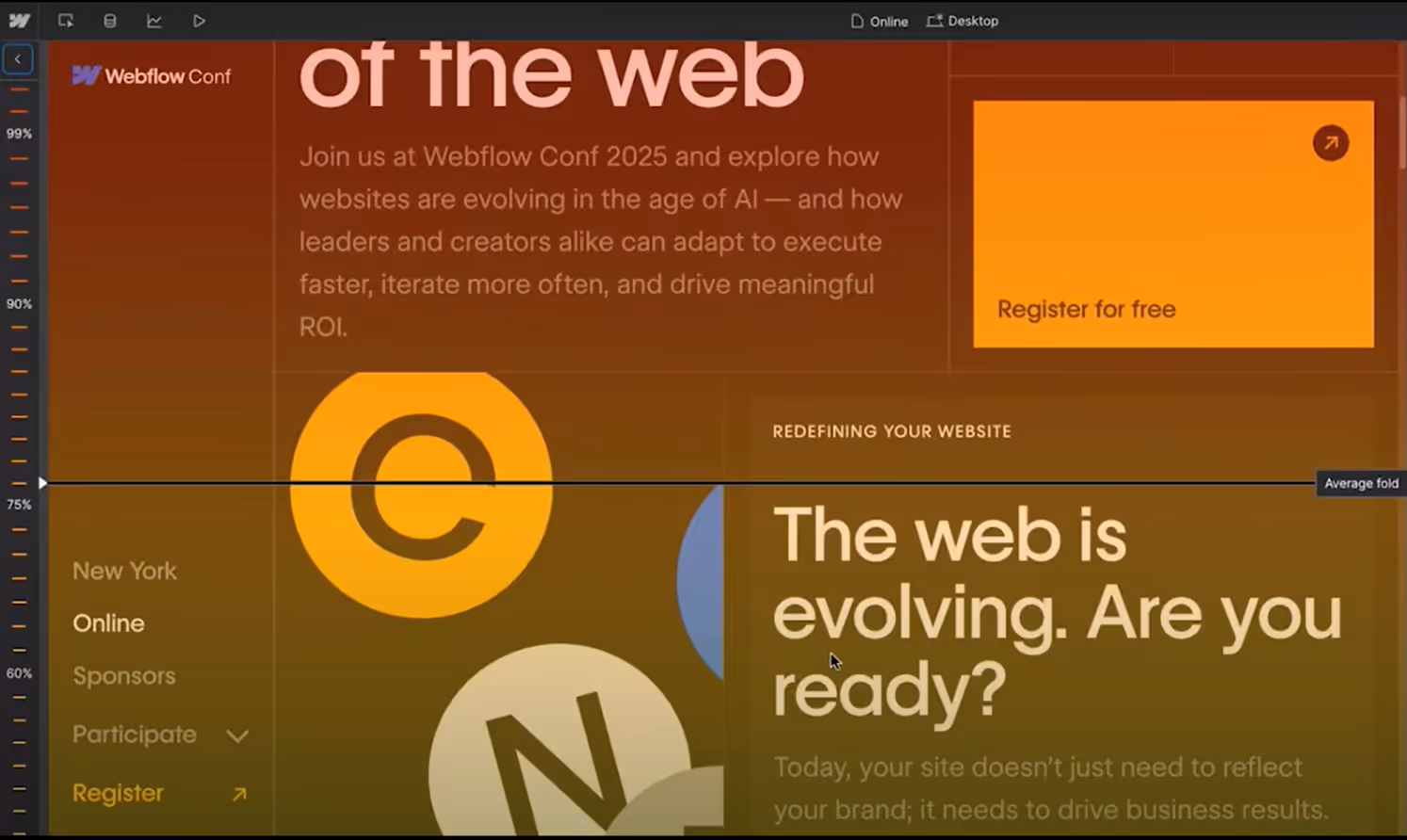
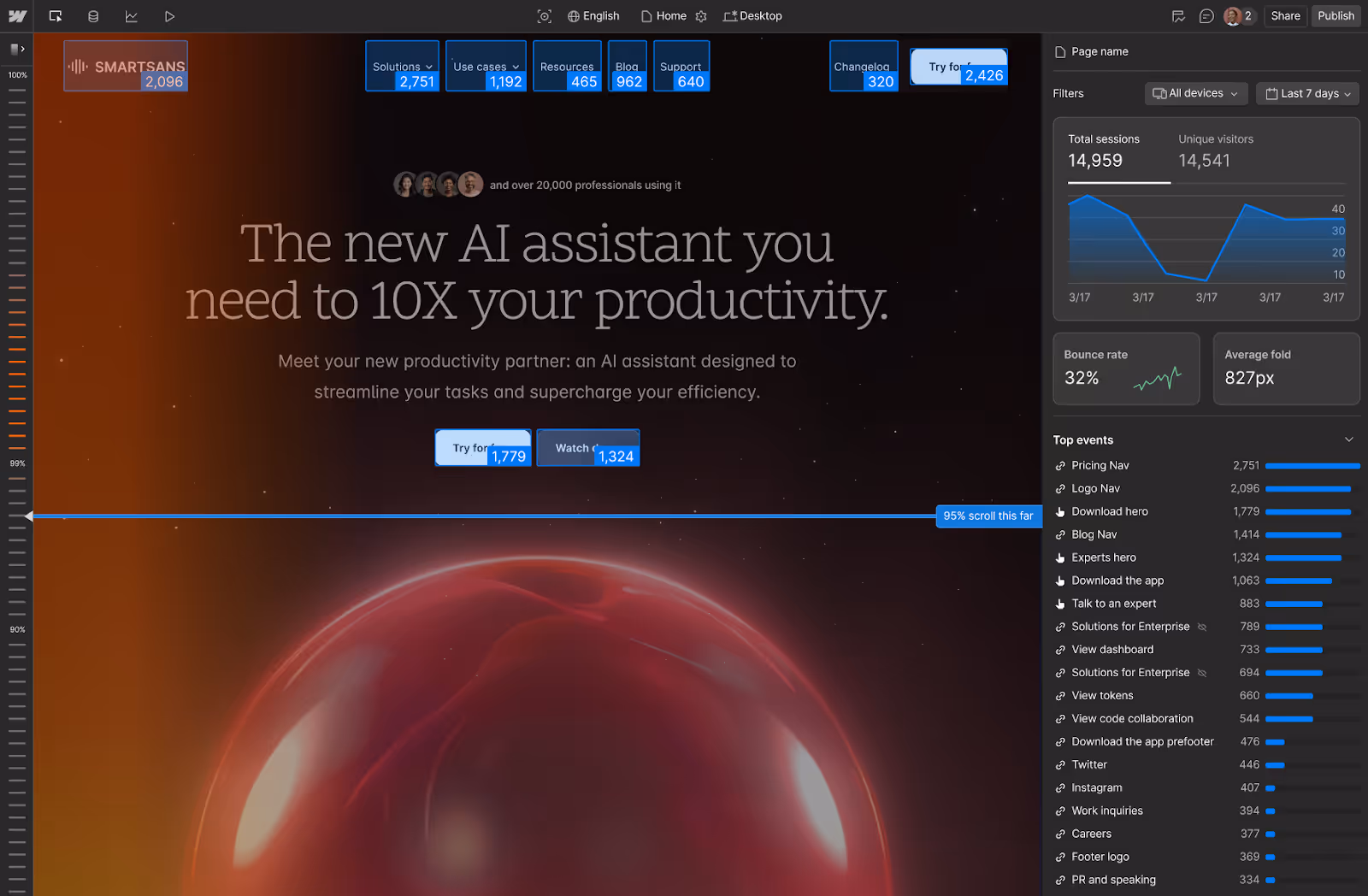
- See Where Visitors Stop: In the Analyze view, the blue fold line is drawn directly across your page - showing how far most users scrolled before dropping off. On the right-hand sidebar, you also see supporting metrics like bounce rate, average fold depth, and the top events users interacted with.
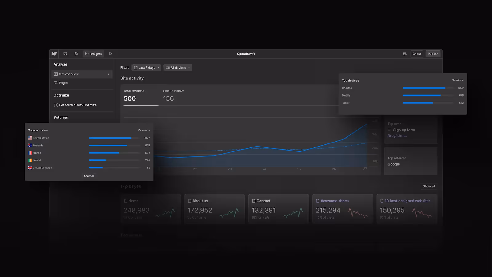
- Understand the Bigger Picture: Inside the Webflow Analyze dashboard, you can also track site-wide metrics like total sessions, unique visitors, top referrers, and which pages or CTAs get the most activity. For example, the dashboard view gives a quick read on where traffic is coming from (top countries, devices), which pages hold attention, and what events users trigger most often
- Track Engagement at a Glance: One of the most useful aspects of Scrollmaps is how they let you see visually where engagement happens on your page. As you scroll, red zones highlight the sections that grab the most attention, while cooler shades show where users begin to drop off. Instead of combing through numbers, you get an immediate sense of what’s working - and what isn’t.
🔴 Red zones = Highly viewed areas
🟡 Yellow zones = Moderate views
🔵 Blue zones = Low visibility.
In Webflow, all of this happens directly inside Analyze Mode - meaning you don’t need to embed third-party scripts, switch tabs, or interpret abstract charts.
The Price Tag
Here’s where things get tricky. Analyze is only available as a paid add-on to Webflow site plans. Pricing currently (Aug 25) starts at $9/month for 2,000 sessions and scales all the way up to $229/month for 500,000 sessions (billed yearly).
For e-commerce stores with thousands of daily visitors, that might feel like a no-brainer. But if you’re a freelancer running campaign landing pages with a few thousand sessions per month, the cost stings a little more.
If your site only gets a few thousand visits, you might be paying more for Analyze than you’ll ever get back in insights.
The Alternatives: Hotjar, Google Analytics & Co.
If you’re on the fence about Webflow Analyze, it’s worth asking: what else is out there? Freelancers already have plenty of options for understanding visitor behavior, from free tools like to dedicated platforms.
The real difference comes down to three things: cost, setup, and speed of insights.
Webflow wins on convenience, Hotjar and Crazy Egg win on depth, and Google Analytics wins on cost - the choice depends on how much speed and simplicity are worth to you.
The Freelancer’s Dilemma: Is It Worth It?
Here’s the heart of it: if you’re building mostly single-purpose landing pages, you probably don’t need to pay just to learn that “users didn’t scroll far enough to see your footer.”
But if you’re:
- Running high-volume campaigns where small conversion lifts mean big ad savings,
- Working with clients who demand proof of design decisions,
- Or managing multiple Webflow sites at scale,
…then Scrollmaps could easily pay for themselves.
For freelancers, the ROI depends less on traffic size and more on how much you value integrated, visual insights vs. using external tools.
Scenarios in Practice: When Scrollmaps Pay Off
Think about it this way: Scrollmaps aren’t a one-size-fits-all magic wand - sometimes they’ll be worth every penny, other times they’ll just drain your budget.
✅ Paid Ads Landing Page
You’re running a campaign that drives 10,000 paid clicks/month at ~$1 per click. If Scrollmaps help you realize that your CTA button is buried too low - and you bump conversions even by 5% - suddenly, Analyze can feel cheap.
✅ Client Reporting
You’ve got a client who always asks “but how do we know people even see this section?” With Scrollmaps, you can literally screenshot the fold line and show them. For some clients, that proof is worth the subscription alone.
❌ Portfolio Site
If your site only gets ~300 visits/month (mostly referrals), Analyze won’t move the needle. Free tools like Google Analytics or Clarity will be enough.
❌ One-Off Campaign
You’re building a one-time event page that will only get a few thousands of visitors total. Paying for Analyze just to learn people didn’t scroll to the footer isn’t a good ROI.
The more traffic you push, the more valuable the insights become.
Final Thoughts
Scrollmaps in Webflow Analyze are powerful - no doubt about it. They bring insights right into your design workflow. But for landing page builders and designers, the real question isn’t “are they good?” (they are), it’s “are they worth the price compared to Hotjar or GA?”
POV: If you’re testing a lot of variations or reporting back to demanding clients, Analyze could be a lifesaver. But if you’re bootstrapping and just need to know if your CTA is visible, a free or cheaper tool might do the job just as well.