The 80/20 Rule of High-Converting Landing Pages
The 80/20 Rule of High-Converting Landing Pages
If you’ve ever wondered why some landing pages convert like crazy while others flop, here’s the hard truth: most of what’s on the page doesn’t really matter.
According to the 80/20 principle, 80% of your results come from just 20% of your inputs. In landing page design, that means a small handful of elements drive most of your conversions - and the rest is nice to have, but not make-or-break.
For designers, marketers, and CRO specialists, mastering that 20% is where the magic (and the money) happens.
What’s the 20% That Really Drives Conversions?
After reviewing hundreds of high-performing pages, here’s the shortlist that consistently moves the needle:
- Benefit-Driven Headline - Your first 3-5 words decide if people scroll or bounce.
- Obvious Call-to-Action - It should be impossible to miss and compelling to click.
- Above-the-Fold Visuals - Hero images or videos that make the offer desirable.
- Social Proof - Reviews, testimonials, logos, or trust badges placed near the CTA.
- Mobile Experience - simple navigation, and tap-friendly CTAs.
If you only optimized these five things on a page, you’d probably get 80% of the conversion lift.
Why This Matters
Designers often get stuck perfecting everything - pixel-perfect illustrations, extra sections, or playful animations. While those can help, the truth is most of your conversions will come from a tiny part of the page.
Before you obsess over polishing the 10th FAQ or redesigning the footer, make sure the core 20% is absolutely bulletproof.
How to Apply the 80/20 Rule to Your Landing Pages
Think of your landing page as prime real estate. Every pixel above the fold is fighting for attention, but not every pixel pulls its weight. Instead of getting lost in decorative details, zero in on the pieces that directly influence whether a visitor takes action.
- Identify the Conversion Path - What’s the primary action you want users to take? (e.g., sign up, buy, book a call)
- Map the Critical Elements - Make sure headline, CTA, hero image, and trust signals all directly support that action.
- Cut the Clutter - Remove or move anything above the fold that doesn’t help conversions.
- Test and Iterate - Use A/B testing to tweak only the core 20% first before touching the rest.
Real-World Examples of the 80/20 Rule in Action
Calendly
Calendly nails the 80/20 by focusing the hero entirely on one action - sign up. The headline is plain English (“Easy scheduling ahead”), the subhead builds trust with huge social proof (“20 million professionals…”), and the primary CTAs are frictionless. Everything else is secondary.

Shopify
https://www.shopify.com/free-trial
Shopify’s free trial page strips away every possible barrier. A single bold CTA (“Start free trial”), a simple form, and one reassuring benefit-driven line are all you see above the fold. Directly below, trust logos from major brands reinforce credibility. That’s the 20% of elements that push 80% of signups.

Miro
https://miro.com/brainstorming/
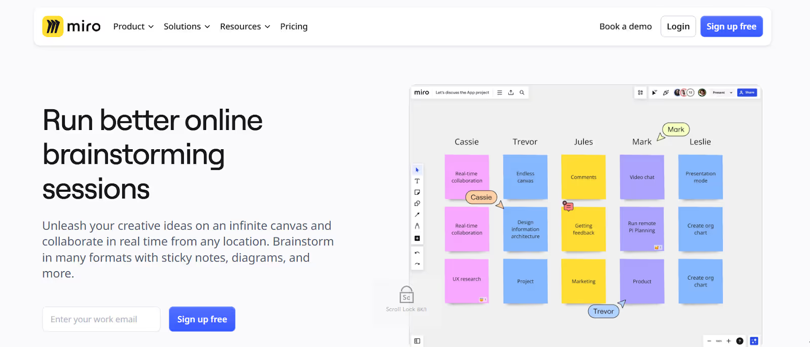
Miro’s hero section works because it feels like you’re already inside the product from the first second. Instead of a wall of text, it opens with a bold promise - “Run better online brainstorming sessions” - and immediately backs it up with a strong illustration. The CTA (“Sign up free”) sits right under a one-line form, making the barrier to entry almost nonexistent.

Audit your last landing page: Can you identify the headline, benefit, and CTA within 3 seconds? If not, simplify.
Common 80/20 Mistakes to Avoid
We’ve all been there - obsessing over a button’s shade of blue while the headline is tanking conversions. That’s the danger of misusing the 80/20 rule. Here are the classic blunders that sneak into even the smartest optimization plans:
- Optimizing the wrong 20% - Spending weeks tweaking low-traffic sections while ignoring the hero.
- Too many CTAs - Giving users a few choices instead of one clear action.
- Hiding social proof - Burying trust logos or testimonials at the bottom.
- Overloading the hero - Trying to tell the whole story in the first 5 seconds.
The biggest trap, though, is trying to tell your whole story in the hero. Especially for startups, the instinct is to pack everything into the first five seconds - every feature, every selling point, the full origin story. But the smarter play is restraint: lead with the core benefit people can grasp instantly, then let deeper pages or sections do the heavy lifting.
Final Thoughts
The 80/20 rule isn’t just a productivity hack - it’s a CRO superpower. By focusing on the small set of elements that matter most, you save time, avoid design bloat, and drive faster results.
POV: If you test one thing, make it the hero section. It’s your landing page’s first impression and the biggest conversion lever you’ve got. Headline, visuals, and CTA - they decide in seconds whether visitors scroll or bounce. Even small tweaks here, like a headline rewrite or a new product image, can move conversion rates by 20–30% without touching the rest of the page.
If you master the 20%, you can out-convert pages 3x prettier than yours - because pretty doesn’t always sell, but clarity always does.


